What’s wrong with listening for the resize event?
Nothing really, it does the job. This has been the way for years now. There is a downside that comes with this solution, though. Let’s say you have four breakpoints:
smwith a maximum width of 767 pixelsmdwith a minimum width of 768 pixelslgwith a minimum width of 1024 pixelsxlwith a minimum width of 1200 pixels
You’re only really interested in these four pixel values. However, when listening to the resize event, you’ll get an update for every pixel value in between as well. Let's say you are implementing a utility for your React.js project to offer this. A custom React.js hook you can write will probably look a bit like this:
import { useEffect, useState } from 'react';

type ViewportBreakpoint = 'sm' | 'md' | 'lg' | 'xl';

const useViewportBreakpoint = () => {
  const [
    viewportBreakpoint,
    setViewportBreakpoint,
  ] = useState<ViewportBreakpoint>('sm');

  useEffect(() => {
    const onResize = () => {
      if (window.innerWidth < 768) {
        setViewportBreakpoint('sm');
        return;
      }

      if (window.innerWidth < 1024) {
        setViewportBreakpoint('md');
        return;
      }

      if (window.innerWidth < 1200) {
        setViewportBreakpoint('lg');
        return;
      }

      setViewportBreakpoint('xl');
    };

    window.addEventListener('resize', onResize);
    onResize();

    return () => window.removeEventListener('resize', onResize);
  }, []);

  return viewportBreakpoint;
};

export default useViewportBreakpoint;
Sure, you could use requestAnimationFrame to optimize this a bit further, but inherently you’re going to receive far more updates than you actually need.
Cool, so how does matchMedia fix that?
On the window object, you’ll find a method called matchMedia. With this method, you can listen for a media query, just like in CSS, to respond to. The basic usage looks like this:
const mql = window.matchMedia('(min-width: 768px)');

const handleQueryChange = ({ matches }) => {
  console.log(matches); // true or false
};

mql.addEventListener('change', handleQueryChange);
That’s it! Every time the viewport passed 768 pixels, you’ll receive an update. You can then handle your business logic based on whether the media query is met.
Let’s make a custom hook!
Now, let’s take the above principle and create a custom hook that will support all four of the viewport breakpoints:
import { useEffect, useState } from 'react';

type ViewportBreakpoint = 'sm' | 'md' | 'lg' | 'xl';

const useViewportBreakpoint = () => {
  const [
    viewportBreakpoint,
    setViewportBreakpoint,
  ] = useState<ViewportBreakpoint>('sm');

  useEffect(() => {
    const smQuery = window.matchMedia('(max-width: 767px)');
    const mdQuery = window.matchMedia('(min-width: 768px) and (max-width: 1023px)');
    const lgQuery = window.matchMedia('(min-width: 1024px) and (max-width: 1199px)');
    const xlQuery = window.matchMedia('(min-width: 1200px)');

    const handleSmQueryChange = ({matches} : {matches: boolean}) => matches && setViewportBreakpoint('sm');
    const handleMdQueryChange = ({matches} : {matches: boolean}) => matches && setViewportBreakpoint('md');
    const handleLgQueryChange = ({matches} : {matches: boolean}) => matches && setViewportBreakpoint('lg');
    const handleXlQueryChange = ({matches} : {matches: boolean}) => matches && setViewportBreakpoint('xl');

    smQuery.addEventListener('change', handleSmQueryChange);
    mdQuery.addEventListener('change', handleMdQueryChange);
    lgQuery.addEventListener('change', handleLgQueryChange);
    xlQuery.addEventListener('change', handleXlQueryChange);

    handleSmQueryChange({matches: smQuery.matches});
    handleMdQueryChange({matches: mdQuery.matches});
    handleLgQueryChange({matches: lgQuery.matches});
    handleXlQueryChange({matches: xlQuery.matches});

    return () => {
        smQuery.removeEventListener('change', handleSmQueryChange);
        mdQuery.removeEventListener('change', handleMdQueryChange);
        lgQuery.removeEventListener('change', handleLgQueryChange);
        xlQuery.removeEventListener('change', handleXlQueryChange);
    };
  }, []);

  return viewportBreakpoint;
};

export default useViewportBreakpoint;
Wow! Quite a bit of boilerplate. As you can only listen for on media query, you’ll have to quadruple the code. Before we optimize this, let’s have a look at the different parts.
Firstly, you now have to set a minimum and maximum width for the different media queries. Previously, you could bail out as soon as a viewport was matched. As these are all different events, they will all trigger. This can cause multiple media queries to match. By adding maximum widths, you can circumvent this.
Secondly, the callback function when a change event is detected does receive the media query it matched against, but we then have to map which ViewportBreakpoint it belongs to. If you don’t want to add this complexity, you have to create four separate callbacks.
Finally, as you have to add four event listeners, you have to remove four of them as well. This is a bit annoying.
Time to refactor
Firstly, you could refactor the callback to a single one and check each media query to conditionally set the value for the active viewport breakpoint:
import { useEffect, useState } from 'react';
type ViewportBreakpoint = 'sm' | 'md' | 'lg' | 'xl';
const useViewportBreakpoint = () => {
  const [
    viewportBreakpoint,
    setViewportBreakpoint,
  ] = useState<ViewportBreakpoint>('sm');

  useEffect(() => {
    const smQuery = window.matchMedia('(max-width: 767px)');
    const mdQuery = window.matchMedia('(min-width: 768px) and (max-width: 1023px)');
    const lgQuery = window.matchMedia('(min-width: 1024px) and (max-width: 1199px)');
    const xlQuery = window.matchMedia('(min-width: 1200px)');

    const checkMatch = () => {
        smQuery.matches && setViewportBreakpoint('sm');
        mdQuery.matches && setViewportBreakpoint('md');
        lgQuery.matches && setViewportBreakpoint('lg');
        xlQuery.matches && setViewportBreakpoint('xl');
    };

    smQuery.addEventListener('change', checkMatch);
    mdQuery.addEventListener('change', checkMatch);
    lgQuery.addEventListener('change', checkMatch);
    xlQuery.addEventListener('change', checkMatch);
    checkMatch();

    return () => {
        smQuery.removeEventListener('change', checkMatch);
        mdQuery.removeEventListener('change', checkMatch);
        lgQuery.removeEventListener('change', checkMatch);
        xlQuery.removeEventListener('change', checkMatch);
    };
  }, []);

  return viewportBreakpoint;
};

export default useViewportBreakpoint;
This works because you added the maximum widths. Only one will ever match and update the state of the viewport breakpoint.
This does still feel a bit repetitive, though. How can you make this more DRY? Let’s create an array with multiple viewport breakpoints and their media query. You can then loop over this array and execute the logic:
import { useEffect, useState } from 'react';

type ViewportBreakpoint = 'sm' | 'md' | 'lg' | 'xl';
type ViewportBreakpointConfig = {
    size: ViewportBreakpoint;
    mql: MediaQueryList;
};

const useViewportBreakpoint = () => {
  const [
    viewportBreakpoint,
    setViewportBreakpoint,
  ] = useState<ViewportBreakpoint>('sm');

  useEffect(() => {
    const mqls: ViewportBreakpointConfig[] = [
        { size: 'sm', mql: window.matchMedia('(max-width: 767px)') },
        { size: 'md', mql: window.matchMedia('(min-width: 768px) and (max-width: 1023px)') },
        { size: 'lg', mql: window.matchMedia('(min-width: 1024px) and (max-width: 1199px)') },
        { size: 'xl', mql: window.matchMedia('(min-width: 1200px)') }
    ];

    const checkMatch = () => mqls.forEach(({size, mql}) => mql.matches && setViewportBreakpoint(size));

    mqls.forEach((({mql}) => mql.addEventListener('change', checkMatch)));
    checkMatch();

    return () => {
        mqls.forEach((({mql}) => mql.removeEventListener('change', checkMatch)));
    };
  }, []);

  return viewportBreakpoint;
};

export default useViewportBreakpoint;
There you have it! You can now use this custom hook in your React.js application to execute viewport-based logic.
Final thoughts
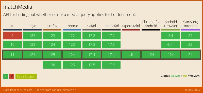
Once in a while, you get surprised about a better way of doing something you’ve been doing the same for years. So, is this a new technique? Well, quite the opposite! The support for matchMedia is great:


