Progressive enhancement
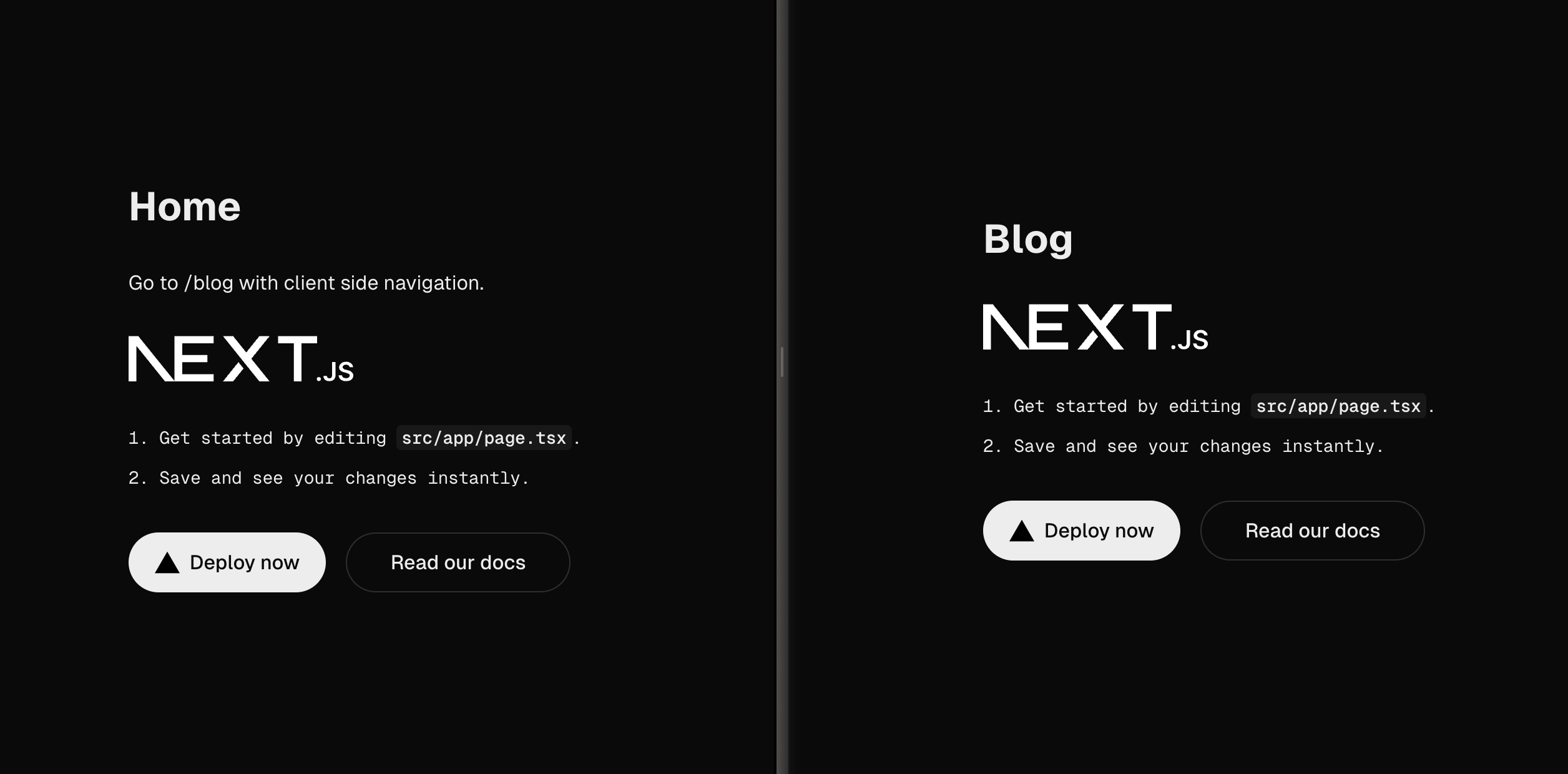
Progressive enhancement is a technique we use to enhance an element when the user’s browser has certain functionalities. By far, the biggest part of progressive enhancement is enhancing elements when CSS and JavaScript are available. The technique is simple. First, built the HTML to always offer a working solution. Then add CSS to make the element more visually appealing. Finally, add some JavaScript to enhance the user experience by adding custom interactivity.
Progressively enhanced custom inputs
So, how to deal with custom inputs? For example a custom three-way switch shown below.
First, break down the functionality the input requires. As a user, you have three choices. We indicate with a color whether the value is active (green), inactive (red) or no preference (grey). The input will have to animate between the options as well.
HTML
First start with the HTML. There are three options the user can select and only one option can be selected at a time. This is a perfect use case for HTML radio inputs. Let’s write that first.
...
<form>
  <fieldset>
    <legend>Would you like to receive news updates?</legend>
    <div>
      <div>
        <input id='inactive' type='radio' name='email-preference' />
        <label for='inactive'>No</label>

        <input id='no-preference' type='radio' name='email-preference' checked />
        <label for='no-preference'>No preference</label>

        <input id='active' type='radio' name='email-preference' />
        <label for='active'>Yes</label>
      </div>
    </div>
  </fieldset>
</form>
...

CSS
I can add styling to make it look like the design with the HTML in place. So I first add some needed wrapping divs and classes to the existing HTML for the CSS.
...
<body data-has-js='false'>
  <form>
    <fieldset>
      <legend>Would you like to receive news updates?</legend>
      <div class='switch-wrapper'>
        <div class='switch'>
          <input id='inactive' class='switch__input' type='radio' name='email-preference' />
          <label for='inactive' class='switch__label'>No</label>

          <input id='no-preference' class='switch__input' type='radio' name='email-preference' checked />
          <label for='no-preference' class='switch__label'>No preference</label>

          <input id='active' class='switch__input' type='radio' name='email-preference' />
          <label for='active' class='switch__label'>Yes</label>

        </div>
      </div>
    </fieldset>
  </form>
</body>
...
After this, add CSS to style the input to look like the proposed design. Then hide the labels for the inputs because you can now use CSS to indicate the chosen value. The below sample uses SCSS, a pre-processor for CSS.
...
.switch__input:checked {
  background-color: var(--color-white);

  &[data-state='active'] {
    [data-has-js='false'] & {
      background-color: var(--color-green);
    }
  }

  &[data-state='inactive'] {
    [data-has-js='false'] & {
      background-color: var(--color-red);
    }
  }

  [data-has-js='true'] & {
      background-color: transparent;
  }
}
...
As you may have noticed, I have added an attribute to the body element to check whether there is JavaScript enabled because some of the styling will just be needed for the non-JavaScript version.

JavaScript
Lastly, some JavaScript is added to make the full version including an animation and containing all the design. I'll first add an HTML element for the, to be animated, active circle that only shows-up when there is JavaScript. I also added a few data attributes to the HTML that will be used as selectors in the JavaScript
...
<body data-has-js='false'>
  <form>
    <fieldset>
      <legend>Would you like to receive news updates?</legend>
      <div class='switch-wrapper' data-switch-wrapper>
        <div class='switch'>
          <input id='inactive' class='switch__input' type='radio' name='email-preference' data-state='inactive' data-switch-input />
          <label for='inactive' class='switch__label'>No</label>

          <input id='no-preference' class='switch__input' type='radio' name='email-preference' data-switch-input checked />
          <label for='no-preference' class='switch__label'>No preference</label>

          <input id='active' class='switch__input' type='radio' name='email-preference' data-state='active' data-switch-input />
          <label for='active' class='switch__label'>Yes</label>

          <span class='switch__pill' data-switch-pill />
        </div>
      </div>
    </fieldset>
  </form>
</body>
...
With JavaScript, I then indicate that the client has JavaScript.
document.body.setAttribute('data-has-js', true);
After that, all I need to do is listen for inputs by the user and animate the active circle to the active input.
// Needed DOM nodes
const elements = {
  switchWrapper: document.querySelector('[data-switch-wrapper]'),
  inputs: Array.from(document.querySelectorAll('[data-switch-input]')),
  pill: document.querySelector('[data-switch-pill]')
};

// Place pill over passed node
const updatePillPosition = ({target}, animate = true) => {
  const inputIndex = elements.inputs.findIndex(input => input === target);
  const inputState = target.getAttribute('data-state');

  elements.switchWrapper.dataset.animate = animate;
  elements.pill.style.transform = `translate(${inputIndex * target.scrollWidth}px, -50%)`;
  elements.switchWrapper.dataset.state = inputState || 'default';
};

// Check for default checked node

const defaultActiveInput = elements.inputs.find(input => input.checked)

if (defaultActiveInput) { updatePillPosition({target: defaultActiveInput}, false); }

// Listen for input events on the nodes
elements.inputs.forEach(input => input.addEventListener('input', updatePillPosition));
And that makes final result! Always consider building progressively enhanced custom inputs for the web that also work in cases where a screenreader (no CSS) is used or JavaScript is not available.

Final thoughts
Building in a progressively enhanced way is quite a bit of work. So why is it so important? By writing semantically correct HTML, we offer an accessible website for people who, for instance, use a screenreader. By making it work without JavaScript, we make our website accessible for users that can’t or won’t load JavaScript. Our website will deliver the best possible user experience for every user.
Demo
You can find the demo and all the code of the three-way switch we worked on over at CodePen.


